Kx Graphic Design

Kx Graphic DesignKx Graphic DesignKx Graphic Design

Kx Graphic Design

Kx Graphic DesignKx Graphic DesignKx Graphic Design
  • Home
  • About
  • Portfolio
  • Services
  • More
    • Home
    • About
    • Portfolio
    • Services
  • Home
  • About
  • Portfolio
  • Services

Client & Concept Work

This selection of client work and marketing concepts showcases effective branding strategies, social media design, and graphic design portfolio pieces, with each project tailored to meet a specific need and engage the right audience.

Walk on's in-store ads

    wof graphic designs & content creation

    Promotional church events and worship sessions by Word of Faith Family Worship Cathedral.

    Rebranded assets and social media templates

    A comprehensive library of rebranded social media templates built for use across Instagram, Facebook, and YouTube. Templates covered weekly sermon reminders, scripture graphics, ministry announcements, and recurring content formats, all designed to maintain brand consistency while remaining adaptable for the organization's ongoing content calendar.
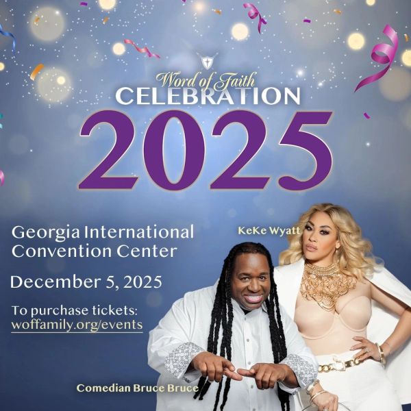
    2025 Word of Faith Celebration at Georgia Int'l Convention Center, Dec 5

    announcements and promos

    High-impact promotional graphics designed for events, campaigns, and special services throughout the year. Work included large-scale event flyers and multi-channel promotional assets.

    Open lock with cross and flying birds logo for Freedom Ministry.

    Logo design

    Custom logo marks for ministries and programs within the Word of Faith organization, including the Freedom Ministry logo. Each mark was rooted in the ministry's identity and mission, delivered in full brand-ready file formats for print and digital use.

    Ignite Wildfire Youth Conference '26

    Social Media Marketing Strategy

    Full-service Instagram ad strategy and creative direction for Word of Faith's 2026 youth conference: 43K+ views, 25K+ site visits, and 200 messaging conversations driven by a $2,485 campaign.

    Download PDF

    Girl Scouts of greater Atlanta internship

      Roary's southern gourmet popcorn

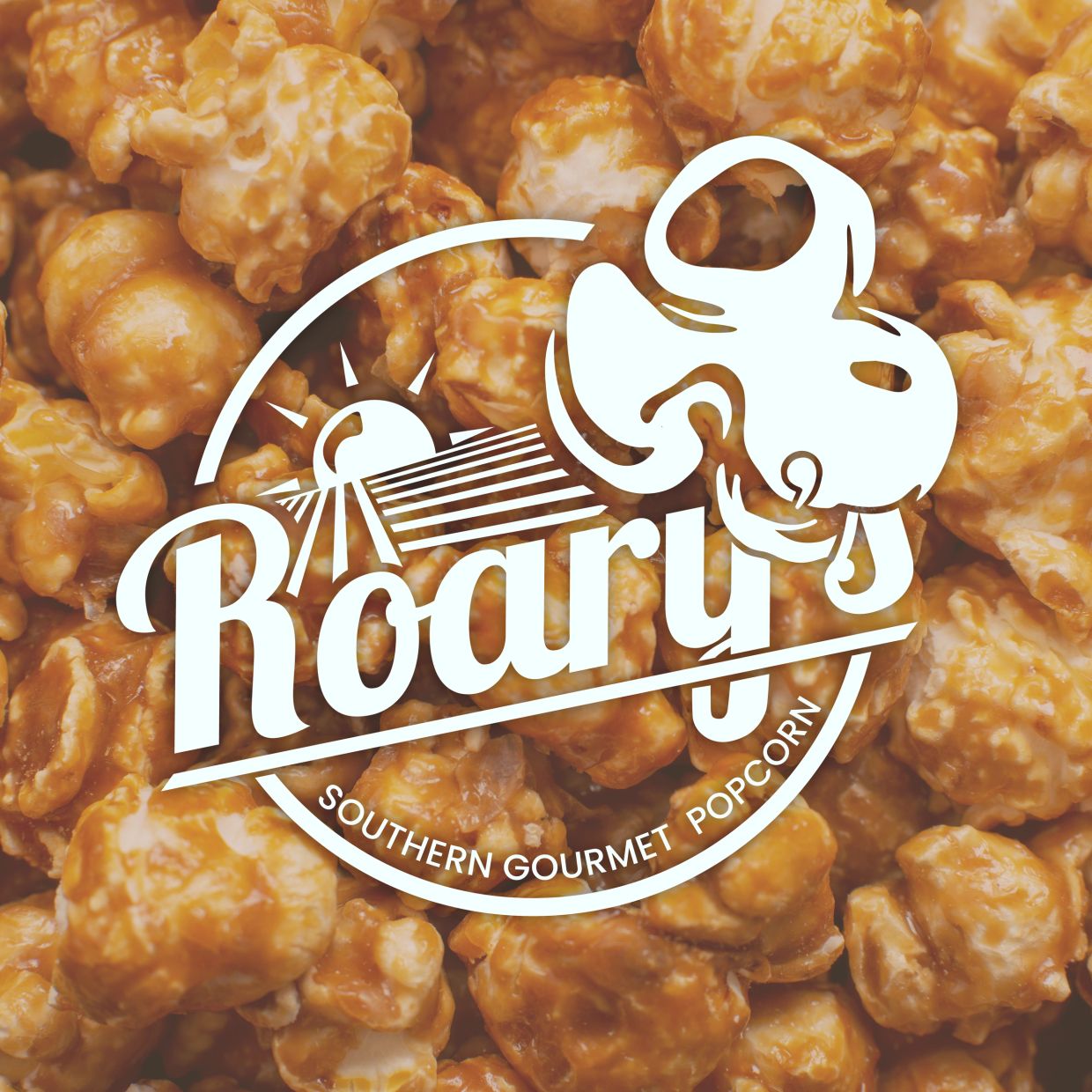
      Close-up of caramel popcorn with a logo overlay.

      Branding and logo design

      A mark built to hold its own on a popcorn bag and still feel at home on a delivery van. The badge logo pairs a tilted, hand-painted script for the name with a clean, letter-spaced "Southern Gourmet Popcorn" underneath, a combination built to say modern nostalgia in a single glance, and to scale from a shelf tag down to a social icon without losing its character.
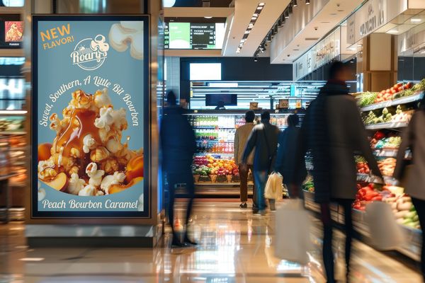
      Advertisement for Roary's new Peach Bourbon Caramel popcorn flavor.

      in store ads

      Designed to stop foot traffic without a wall of text, this ad introduces the Peach Bourbon Caramel launch with a single evocative shot and a headline for the whole campaign: "Sweet, Southern, A Little Bit Bourbon." The photography and product name carry the weight while shoppers are mid-aisle.
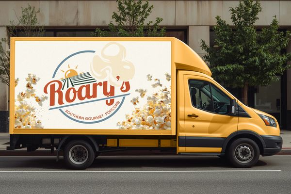
      Yellow truck with Roary's Southern Gourmet Popcorn logo.

      cargo truck promo

      The delivery van became the brand's biggest canvas. Logo and popcorn imagery, blown up to full scale, turn every delivery run into a rolling billboard, built for visibility from a distance, at a stoplight, or in a rearview mirror, and proof the identity holds up outside of packaging and print.

      Three bags of Roary's gourmet popcorn with popcorn scattered around.

      package design

      Three flavors, one system. Each Roary's bag carries the same badge logo and layout structure, but the color shifts flavor to flavor: rust for Bacon Cheddar, deep green for Honey Hot Jalapeño, dusty denim for Fried Green Tomato Ranch. The lineup reads as a family on shelf while each flavor still stands on its own. Real ingredient photography anchors the bottom of each bag, keeping the design modern without losing the warmth of a Southern kitchen.

      new product promotional Reel

      This reel showcases Peach Bourbon Caramel using dynamic motion rather than a static shot, aligning with effective branding strategies. It begins with a close-up of the caramel drip, allowing the visual to convey the message even before any text appears. The campaign headline, "Sweet, Southern, A Little Bit Bourbon," follows, leading into a visual of the packaging complemented by a clear call to action. Designed for sound-off scrolling, this approach reflects innovative marketing concepts, with text timed to effectively deliver the message even without audio, fitting seamlessly into our graphic design portfolio focused on client work and social media design.

      Blake tea Brand Identity & product design

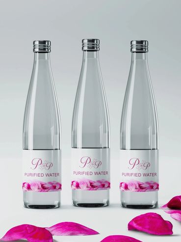
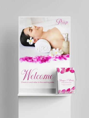
        Pamper & petals Brand Identity & Marketing
        Pamper Petals logo with floral design for luxury massage and spa  by Kindall Wright - KX Graphic Design.
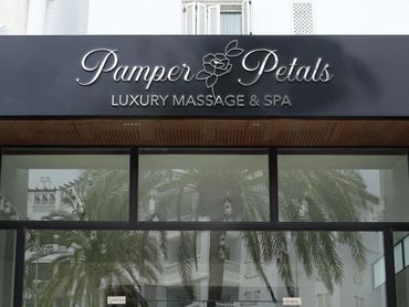
        Black signboard of Pamper Petals Luxury Massage & Spa  by Kindall Wright - KX Graphic Design.
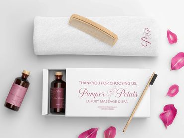
        Luxury spa set with oils, towel, wooden comb, and rose petals  by Kindall Wright - KX Graphic Design.
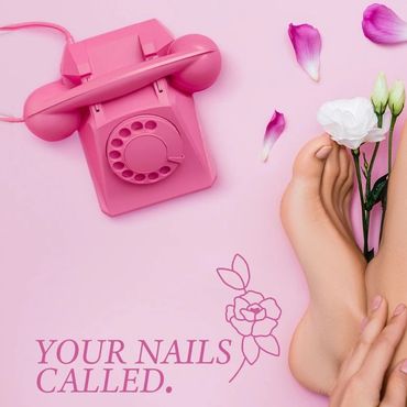
        Pink-themed pedicure promotion with flowers and vintage phone  by Kindall Wright - KX Graphic Design.
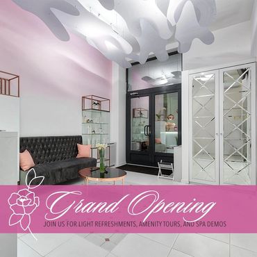
        Modern spa lobby with pink accents and elegant decor for grand opening  by Kindall Wright - KX Graphic Design.
        Man receiving a facial treatment with cream being applied on his face  by Kindall Wright - KX Graphic Design.
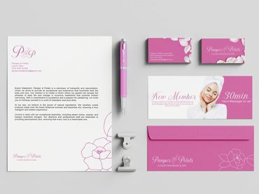
        Pamper & Petals luxury spa branding with pink and white theme  by Kindall Wright - KX Graphic Design.
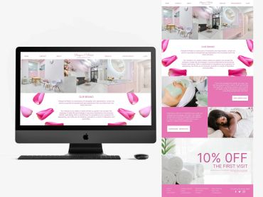
        Pamper & Petals spa website displayed on an iMac, showcasing tranquil and luxurious spa services  by Kindall Wright - KX Graphic Design.
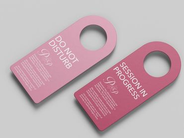
        Two pink spa door hangers with messages about privacy and session progress  by Kindall Wright - KX Graphic Design.
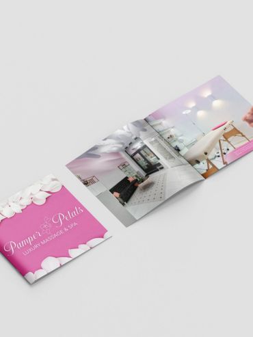
        Pamper Petals luxury massage and spa brochure with elegant pink and white design  by Kindall Wright - KX Graphic Design.

        Promotional Reel

        This reel showcases Pamper & Petals, a luxury massage and spa concept. It introduces the brand while giving potential clients a clear sense of what a visit feels like. Together, soft blush pinks, script typography, and rose-petal textures carry the brand's romantic, botanical identity from the opening frame through the closing logo reveal. Layered captions walk viewers through the core service menu: massage therapy, customized facials, and mani/pedis.

        Drowned grounds landing page, collateral & package design

          Skin Affair brand identity & package design

          Woman with a towel on her head in a red-tinted image with text.

          Logo Design

          Skin Affair is a luxury skincare brand built around the belief that skin deserves better. The brand urges customers to "cheat" on their current skincare routine to have an "affair" with Skin Affair's customized routine. A comprehensive brand system spans logo design, product packaging, social media assets, print advertising, and interactive UX prototypes that's built to create a cohesive identity that feels as premium as the products themselves.
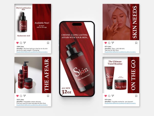
          Skincare product ads focused on moisturizing and skincare routines.

          Social media assets

          A library of social media content for Skin Affair spans product launches, skin tips, promotional campaigns, and routine-building content. Each post was designed to stop the scroll while staying true to the brand's deep red and editorial visual identity, building a feed that feels as intentional as the products it promotes.
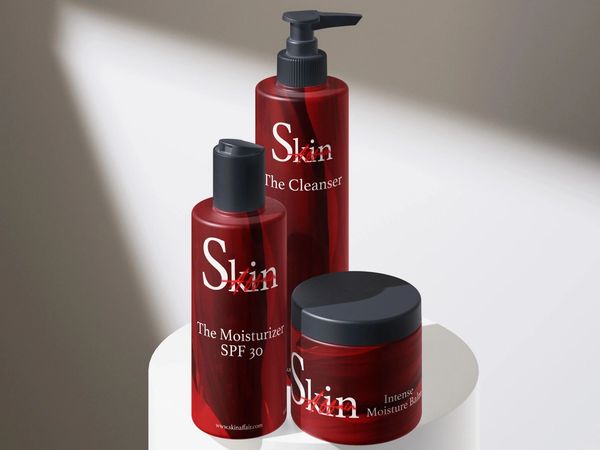
          Red skincare product bottles on a white pedestal.

          Product packaging design

          Packaging designed for the full Skin Affair line, including the Cleanser, Moisturizer SPF 30, Intense Moisture Balm, and on-the-go travel sizes. Every label was crafted to reflect the brand's premium positioning.

          Open magazine showcasing a skin care product summer sale.

          Print ad design

          A full-spread print advertisement for Skin Affair's Summer Sale campaign, featuring the product line in an editorial layout built for magazine placement. The ad balances bold promotional messaging with the elevated aesthetic of the brand, proving that a sale can still feel luxurious.

          Prototype skin care kiosk interface with three screens

          Kisok prototype (figma)

          An interactive in-store kiosk experience for Skin Affair, designed in Figma, lets customers reorder their last routine, discover new products, and complete a personalized skin quiz. The prototype walks users through a branded touchscreen journey from welcome screen to order confirmation. The goal: bridge the physical retail experience with the brand's digital identity.
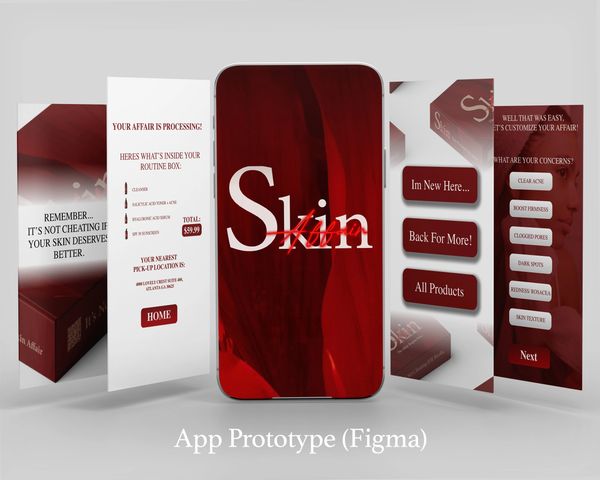
          Skin care app prototype showcasing personalized routines and concerns.

          App prototype (figma)

          A mobile app prototype built in Figma guides users through a personalized skincare consultation, helps them identify their skin concerns, and recommends the right Skin Affair products for their routine. The interface carries the full brand visual system into a seamless, intuitive digital experience.

          Kiosk Prototype task example (Figma)

          A skincare app interface with user profile creation and product selection  by Kindall Wright - KX Graphic Design.

          Bruster's rebrand

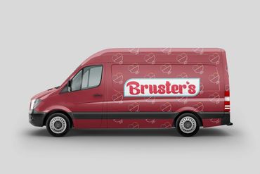
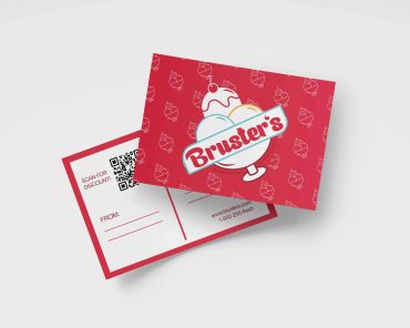
          Brusters logo with ice cream scoops and cherry  by Kindall Wright - KX Graphic Design.
          Logotype of Bruster's Real Ice Cream with a red, white, and blue color scheme  by Kindall Wright - KX Graphic Design.
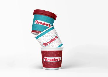
          Stacked Bruster's ice cream cups in vibrant colors against a white background  by Kindall Wright - KX Graphic Design.
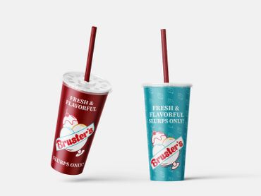
          Two colorful Bruster's slushie cups with red straws on a plain background  by Kindall Wright - KX Graphic Design.
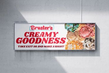
          Billboard advertising Bruster's creamy ice cream goodness with directions  by Kindall Wright - KX Graphic Design.
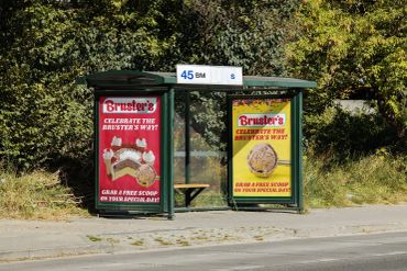
          Bus stop with Bruster's ice cream ads offering free scoops on special days  by Kindall Wright - KX Graphic Design.
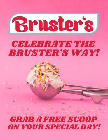
          Bruster's offers a free ice cream scoop to celebrate your special day  by Kindall Wright - KX Graphic Design.
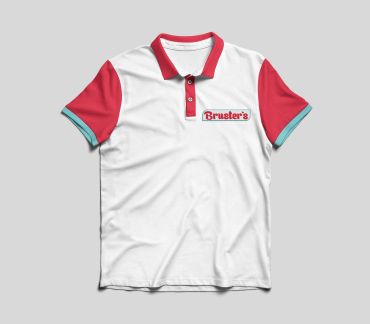
          White polo shirt with red sleeves and "Bruster's" logo on chest  by Kindall Wright - KX Graphic Design.
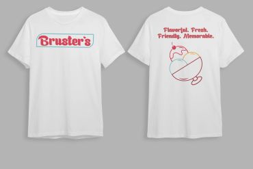
          White T-shirt with Bruster's logo and ice cream design  by Kindall Wright - KX Graphic Design.
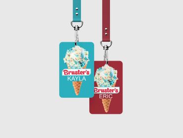
          Two colorful Bruster's ice cream-themed ID badge lanyards with names Kayla and Eric  by Kindall Wright - KX Graphic Design.

          Mini brand: Westlee painting

            Mini brand: Roons by Rachel

              Copyright © 2026 KX Graphic Design - All Rights Reserved.

              Powered by GoDaddy

              • Home
              • Portfolio
              • Services
              • Client Work & Concepts
              • Environmental Design
              • Traditional Artwork

              This website uses cookies.

              We use cookies to analyze website traffic and optimize your website experience. By accepting our use of cookies, your data will be aggregated with all other user data.

              DeclineAccept